Member-only story
UI/UX For LLMs
I don’t know about you, but I find my interactions with LLMs, ( mostly chatGPT and bard ) to be a mix of good and bad, but mostly a bit cumbersome and maybe not as useful as they could be, some of it comes from the nature of the chat based AIs, but there’s also some UI (User Interaction) and UX ( User Experience ) issues that might be at fault, in any case this is a brief look at LLMs from the design point of view….
⚠️ Even as I am typing this there are changes rolling out for these and
other LLMs, see further below for a specific case, so things will surely
change and this article will mostly serve for the historical records.
Let’s first take a look at their UIs :

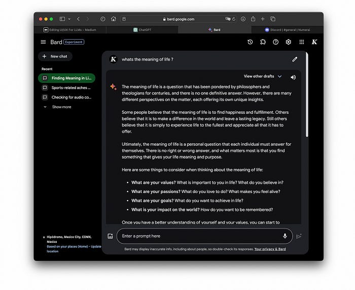
Google’s bard is a clear case of “you can copy my homework but change it a bit so it’s not obvious you copied” :

The current LLM UI/UX prototype consists of a prompt input fixed/floating/parked at the bottom, the generated content on top and some basic organizational tools on the left, this design inherits mostly from existing web and mobile UI/UXs.
A first set of issues is that well they could look uglish by todays web reading standards, cobbled together rather than designed and quickly becoming a mishmash of mystery icons, features and notices.
I heart for the designers/coders though ❤️ with such a fast moving space
and the nature of the task : "Design an universal interaction system for a
human like quasi AGI", I am perfectly happy to use the tools even if they
are cumbersome and understand design might be low on the totem pole
right now.
Quick fixes ?
If you use LLMs on the daily, you might yearn for the simplicity and elegance of Medium or eBook readers, here’s a simple mockup of what that would look like:
