Member-only story
Visualization for Data Science in Python
Choosing a library :
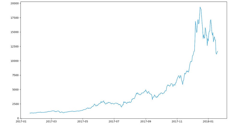
There seems to be a number of libraries out there, our first objective will be to try out a few of them to get a feel on how easy or hard they are, our first dataset will simply be a labeled time series:
Dataset : (Coindesks Bitcoin's yearly close price) :https://github.com/KenoLeon/PythonDev/blob/master/visualization/coindeskBTC.csvSourceFiles: https://github.com/KenoLeon/PythonDev/tree/master/visualization
1. Matplotlib:
#Import Libraries
import matplotlib.pyplot as plt
import pandas as pd# Read DataFrame ( and parse axis dates)
df = pd.read_csv("visualization/coindeskBTC.csv", usecols=['Date','BTC Close'], parse_dates=['Date'])# Use Date as index
df.set_index('Date',inplace=True)# Plot & show
plt.plot(df['BTC Close'])
plt.show()

Super straightforward no frills out of the box solution, you can add options and formatting galore.
